Pantone has chosen a colour that barely looks like a colour at all for 2026. The global authority on colour announced that Cloud Dancer, a soft, natural white, will define the coming year. It’s a quiet pick, especially after several years of saturated tones dominating fashion, design, and branding.
Cloud Dancer sits in the Pantone catalogue as 11-4201, a shade described as airy, billowy, and warm enough to avoid the sterility people often associate with pure white. Pantone says the intention behind the choice is simple: people want calm. After years of overstimulation, the company believes the world is gravitating toward softness, clarity, and visual breathing room.
A “blank canvas” for a cluttered world
Pantone framed Cloud Dancer as a reset button. A mental pause. Something that feels like fresh linen, open space, or early morning light before anything chaotic has a chance to intrude. Officials described it as a “canvas for creativity” rather than a bold statement, implying that the colour is less about itself and more about what it allows.
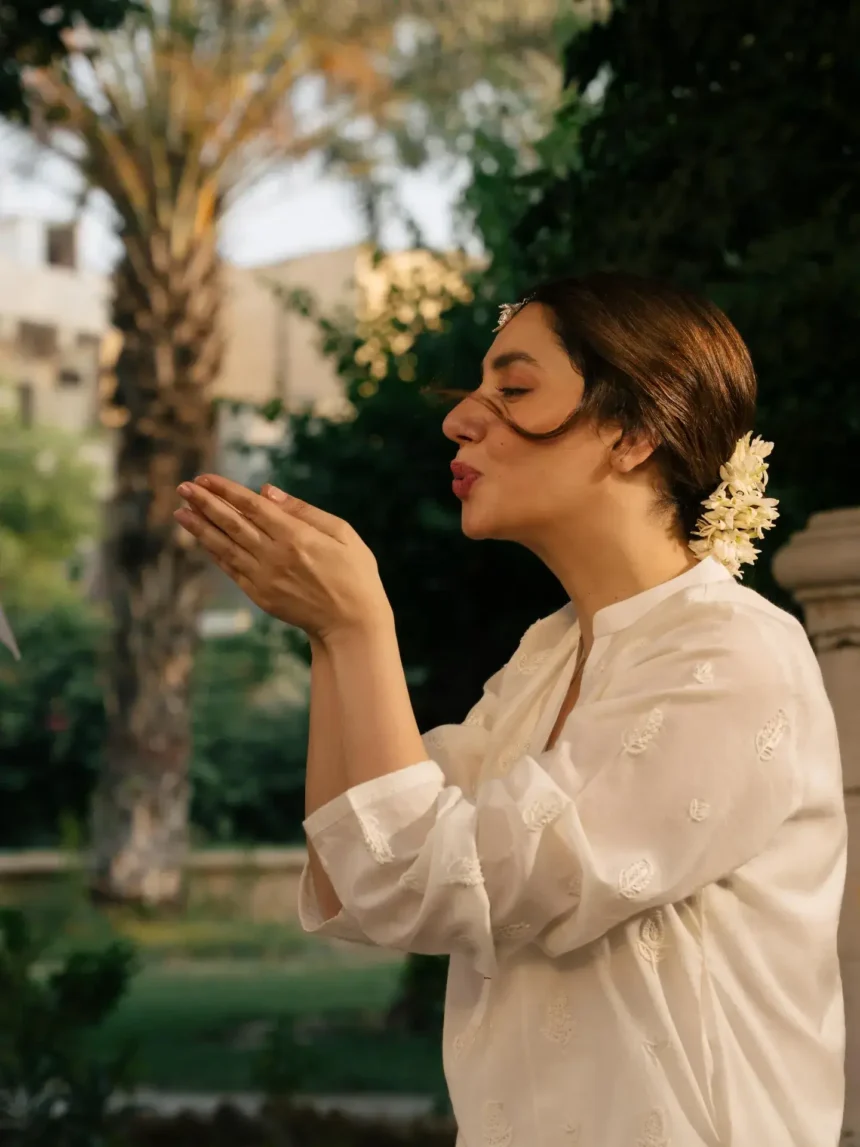
Designers have already begun interpreting it that way. In early trend moodboards, Cloud Dancer appears in soft linen silhouettes, edited-down interiors, pared-back branding, and minimalist beauty looks that lean into natural tones.
This isn’t cold minimalism. It’s gentler. Warmer. Something meant to feel lived-in rather than clinical.
Praise, pushback, and a bit of controversy
Not everyone is thrilled with the choice. Some critics argue that a white shade feels underwhelming, especially when global design trends have been leaning toward emotionally expressive palettes. A few commentators called the decision “safe” or “predictable,” while others raised concerns about cultural and practical perceptions of whiteness in design.
But for many, Cloud Dancer lands exactly right. It echoes a growing desire for clarity and quiet — a counterpoint to a world that feels noisier every year. Fashion insiders and interior designers are already predicting a surge in soft neutral rooms, minimal wardrobes, and packaging that leans into gentle whites.
Where you’ll see Cloud Dancer in 2026
Expect it everywhere:
-
Fashion: relaxed silhouettes, textured fabrics, soft tailoring.
-
Interiors: airy spaces, muted palettes, natural materials.
-
Branding & product design: packaging and interfaces that prioritize calm over colour clutter.
The appeal is clear: Cloud Dancer is a colour that doesn’t shout. It barely even whispers. And that, in a year where people are craving stillness, might be exactly what makes it powerful.