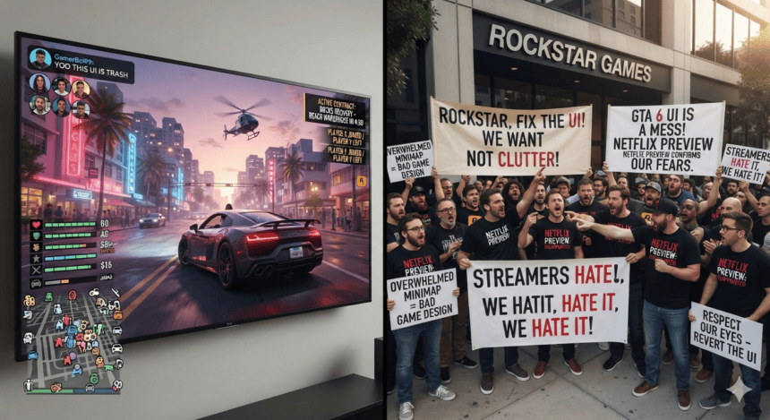
Rockstar Games is facing an unexpected wave of criticism following a leaked preview of *Grand Theft Auto VI’s* user interface. The point of contention? A minimalist, high-contrast minimap and HUD that fans claim looks more like a mobile streaming app—specifically Netflix—than a gritty, open-world crime epic.
The backlash ignited on social media platforms and gaming forums late Tuesday. Players who have spent years dissecting every frame of the original trailer are now arguing that the UI’s clean lines and stark geometry clash with the series’ established aesthetic.
“It’s too sterile,” said one prominent community moderator on Reddit. “The previous games felt like they were part of the world. This just feels like a menu overlay for a subscription service.”
The frustration centers on the minimap’s design. Early screenshots, which Rockstar has yet to officially confirm, show a simplified, circular map with high-transparency borders. While developers typically prioritize “clean” UI to reduce screen clutter, long-time players feel the design strips away the personality inherent in the *GTA V* or *San Andreas* interfaces.
Industry analysts suggest this reaction isn’t just about aesthetics; it’s about expectations. *GTA VI* carries the weight of a decade of anticipation. For many, any deviation from the established “Rockstar style” feels like a dilution of the brand.
“People aren’t just reacting to a map,” said gaming consultant Mark Evans. “They’re reacting to the fear that Rockstar is moving toward a more generic, modern design language that prioritizes accessibility over the raw, chaotic identity of the franchise.”
Rockstar has remained silent on the leaks. The studio rarely acknowledges community feedback during pre-launch windows, preferring to let their trailers dictate the narrative. This radio silence, however, has only allowed the speculation to intensify.
The debate highlights a growing divide between modern UI design trends—which favor flat, high-contrast elements—and the legacy expectations of a fanbase that grew up with the cluttered, neon-soaked menus of the PS2 and PS3 eras.
Whether this design is a final choice or merely a placeholder remains unclear. What is certain is that the pressure on the development team to balance modern clarity with the grit that defined the *Grand Theft Auto* name has never been higher.
For now, the community is left waiting for an official reveal to see if the interface is an intentional shift in art direction or simply a target for unnecessary outrage.